Wireframes
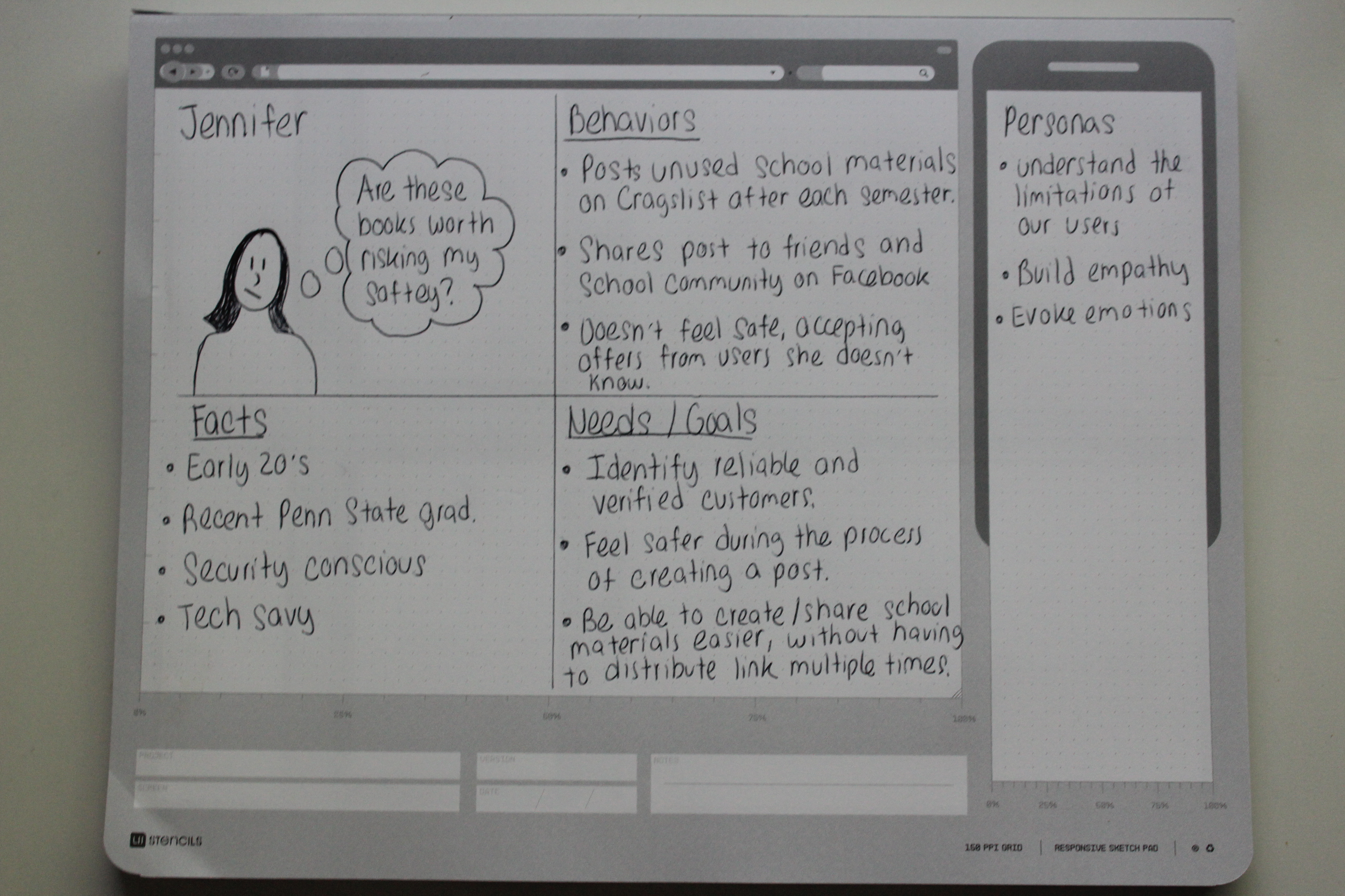
Before creating my wireframes I found it was important to create a persona. Although, this project was a “redesign”, I was redesigning it for the users. When I started my persona I was very happy that I had user feedback to influence my decisions. Since I was limited on time for this assignment, I created one persona that combined the goals and needs from my interviewees. My friends, family and coworkers brought up great points about Craigslist’s current design that I did not consider. This helped me from making assumptions when drawing my persona. My persona’s name is Jennifer. Jennifer’s persona showcases her goals, pain points and description. Although, she is a frequent Craigslist user for school materials she often feels uncomfortable while browsing the site. When creating my wireframe I had to design for Jennifer, so she could achieve her goal. It is evident that I will not only have to make the site more attractive, but also make Craigslist safe.
I was fascinating to uncover the safety pain point. Many of my interviewees talked about different experiences on Craigslist that all linked back to the precautions of safety and privacy. It was interesting to think about how unattractive the site is today and the unsafe appeal of Craigslist. Craigslist unattractive design very well might be a pain point to these uncomfortable users. I was really excited to bring this unattractive design / safety correlation into my wires.
Let's Get Started
Bringing It All Together
1. Simplify
2. Safety
3. Organization
4. “C” Curve
5. Intuitive
(I ended up removing Intuitive since I felt that it was closely related to organization. Keeping the list short allowed me to remind myself in a matter of seconds what my goals were. These words were to help me, not necessarily help a front-end or back-end developer)
Wireframing
Creating the Wireframes
Since most of the User Experience designers in my office use Sketch I decided to also use It to create my wireframes. When I began working on my wireframes I reviewed my initial research, mood board and semantic exploration. My Pinterest board helped me refresh on some of the topics I explored earlier.
I first reiterated on a few rough sketches before jumping into Sketch. I decided I would use imagery to lure the users in, rather than a jumbled list of categories. This imagery section will be personalized to your likes and recently viewed postings. It will have a similar algorithm like Amazon when the user is logged in.
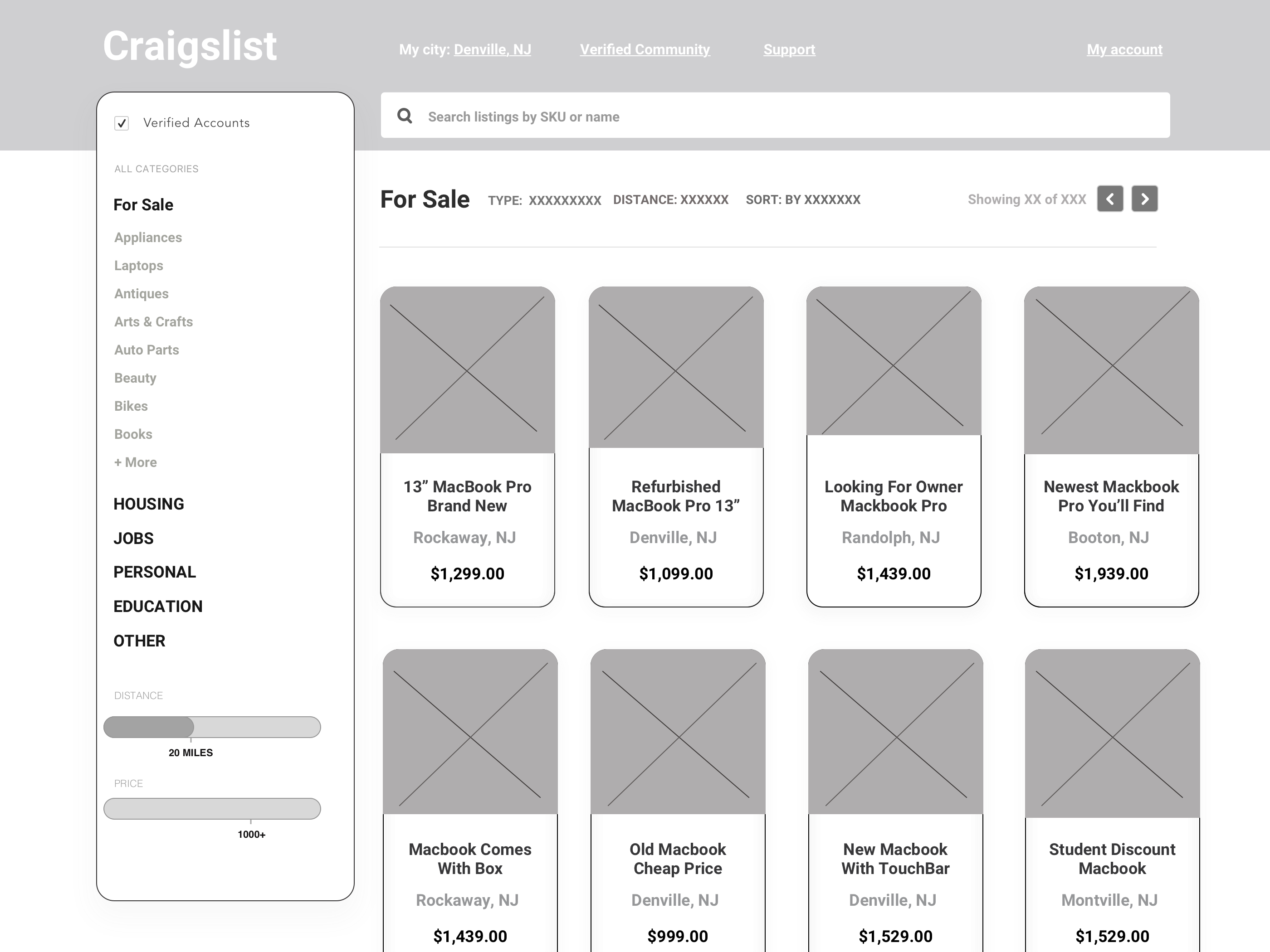
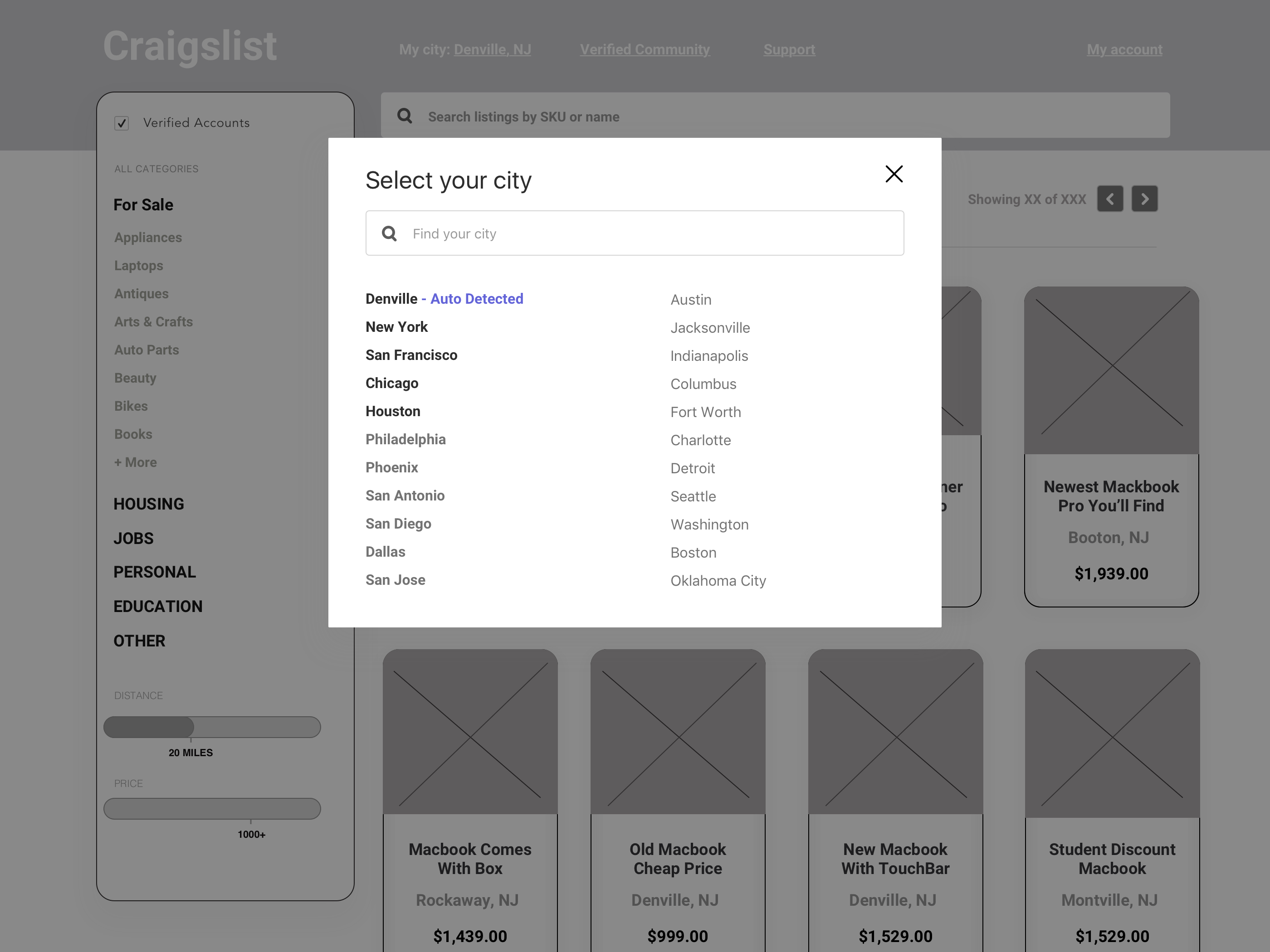
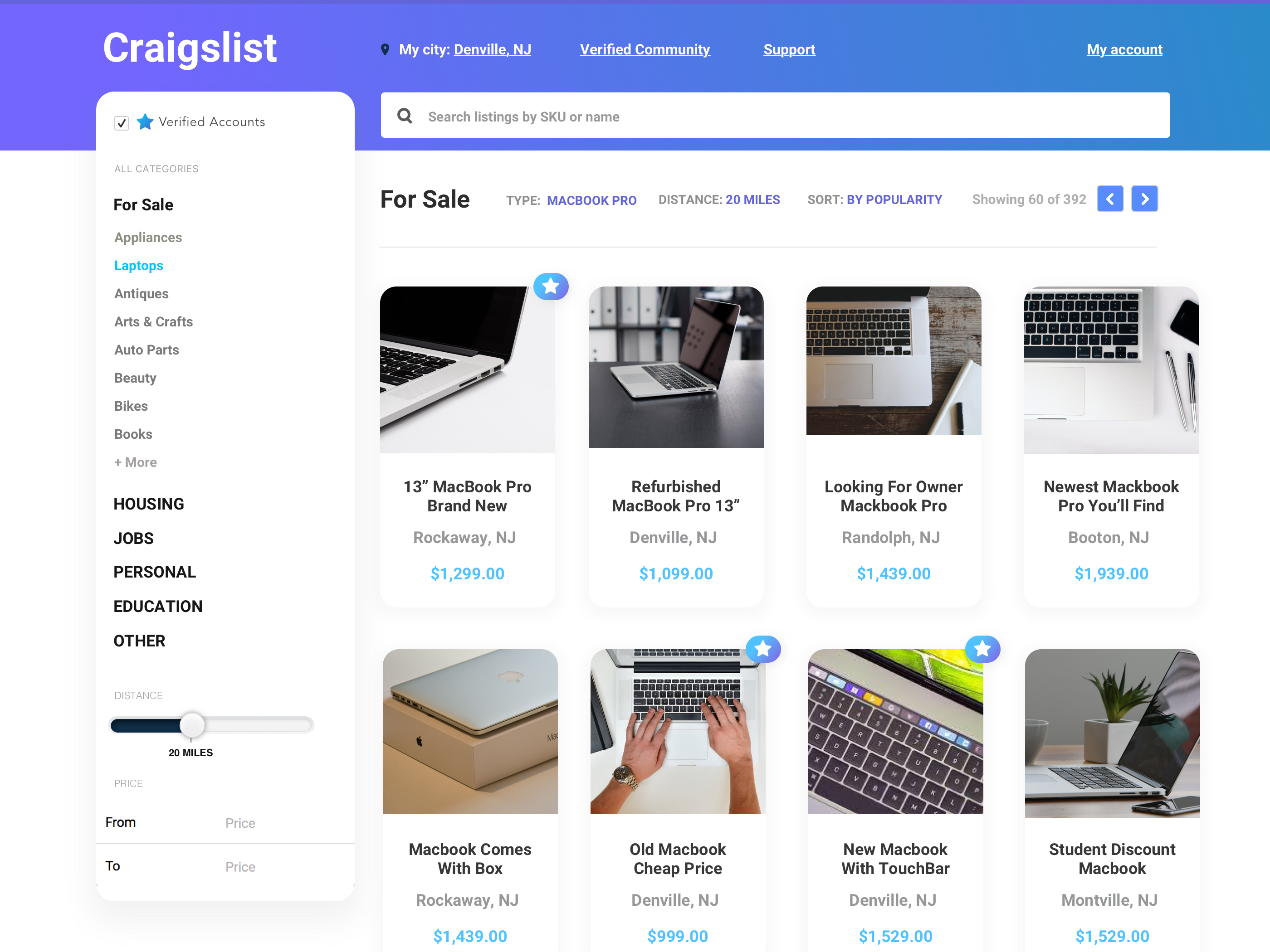
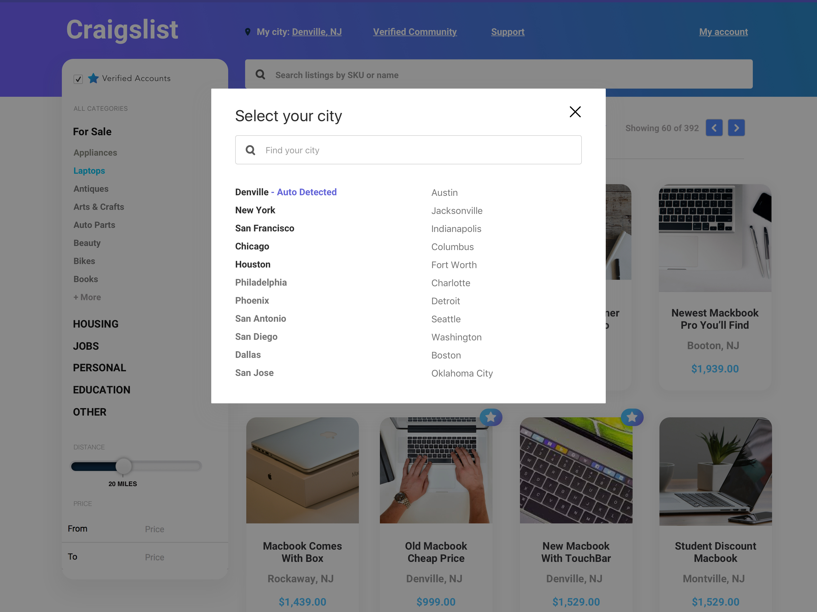
On the left side of my wires you will see a box holding links to the pages on my sitemap. It was important the user could still easily click into a category they were interested in. I also added a check box on the left side filter called, “Verified Users”. When the Verified Users box is selected you will only see the users that have completed their verified account profile and have received a set amount of positive reviews.

In my final design you will notice I used a lot of rounded boxes apposed to sharp edged boxes that Craigslist’s current site has. The rounded corners reflect the “C” curve I explored earlier in my design process.
As I mentioned earlier, I wanted to promote a safer and more comfortable experience for my users. The “Verified Account” check box on the top left of my design will provide a simple solution to filter out accounts that have not been verified or have low reviews. To push the “Verified Users” concept further I put a star icon on all the listings that were selected as a “Verified User”. This would establish a better connection between the logged in user and user who made the listing. I wanted my audience to feel safe by my navigation and design ascetics.
Craigslist Redesign
Conclusion
Craigslist Redesign Overview
Feel free to go home or track back to a previous step you may have missed.
