Color Palette
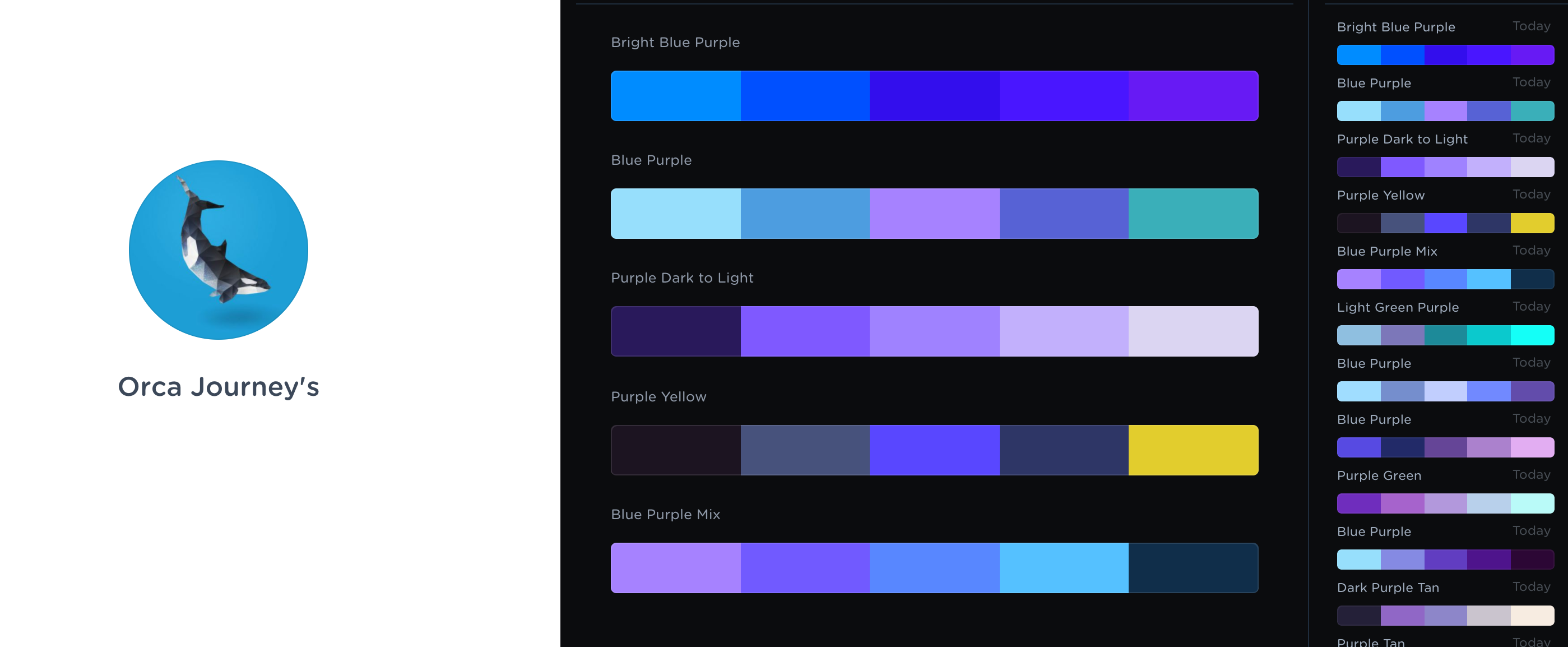
Coolors was a fantastic tool to create my color palette. I first started by creating a new account named after my blog, Orca Journey’s. After I created my account I browsed the site for blue and purple scheme palettes. There were so many beautiful color palettes to choose from. I referenced some of the images in my Purple and Blue mood board for inspiration. While browsing color palettes it was difficult to find one to my exact liking. The palettes I saved served as great inspiration, although amongst these palettes there were at least one or two colors that didn’t feel right to me. This is when I set off to create my own palette on Coolors. By using the saved palettes in collection as a base I was able to make adjustments to the hex colors until I got the perfect shade of purple and blue I was looking for.

User Friendly Colors
Legibility
When selecting the hex colors for my site it was important to remind myself that these colors must be legible. Meaning if most of my colors were bright or light colors I would at least have to select one or two dark colors to create contrast. This dark color would be used for typography, buttons and icons over the lighter or brighter colors.
Webpage FX’s readability tool is a great resource to tell you if your site is legible.
I also came across a site to determine if two over lapping colors are accessible, here. This made selecting my typography color against a specific color easy and fun.

Accessibility
When it comes to web design accessibility is very important. If your website is not accessible you will lose traffic to your site. Technology such as screen readers will help people with disabilities decipher a webpage.

