Browser Compatibility
I was tasked with the assignment to compare and contrast the appearance of my user experience process blog in multiple browsers. The first step I took to completing my assignment was to take screenshots of my homepage (orcajourneys.com) on my 15inch Macbook Pro. I took a screenshot of my process blog utilizing the entire screen in Google Chrome, Safari and Chrome. I chose these three browsers for my assignment, because they are well known to both Mac and PC users.
I took a screenshot by using the command key, (Shift, Command, 4) on my Mac. Alternatively I could have used a plugin. Although, I chose to use the command key function since the results would have varied among the browsers with a screenshot plugin.
Once I took the screenshots I then took a similar approach on my 12.7 inch iPad and iPhone 7. Taking a screenshot off these was a little easier since the browser launches across the entire screen.
Mobile
Google Chrome, Safari, Firefox & Google Now
Below you will see the side by side comparison of Google Chrome, Safari and Firefox on my iPhone 7:




Findings:
I took vertical screenshots of my blog on Google Chrome, Google Now, Safari and Firefox. It was interesting to learn that my blog utilizes the screens pixel density the greatest on Google chrome and the least on Google Now. Although, these browsers are visually different, they all are solving similar problems to give their users the best browser experience on my iPhone 7.
Here are a few things to consider for mobile:
- Smaller display than tablet and desktop.
- Safari is the default browser for iOS
- Gesters differentiate across mobile browsers. (Pan, Zoom, Double Tap Etc.)
- Portable
- Everyday usage
- Push notifications
Observations
- Side bar can not fit
- One blog tile is above the fold
- Hamburger menu used opposed to navigation bar
Here is a great article I found by Thorin Klosowski that compares Google Chrome and Safari on iOS if you are intrested in learning more, https://lifehacker.com/iphone-
Desktop
Google Chrome, Safari, Firefox
Below you will see the side by side comparison of Google Chrome, Safari and Firefox on my 15inch Macbook Pro:
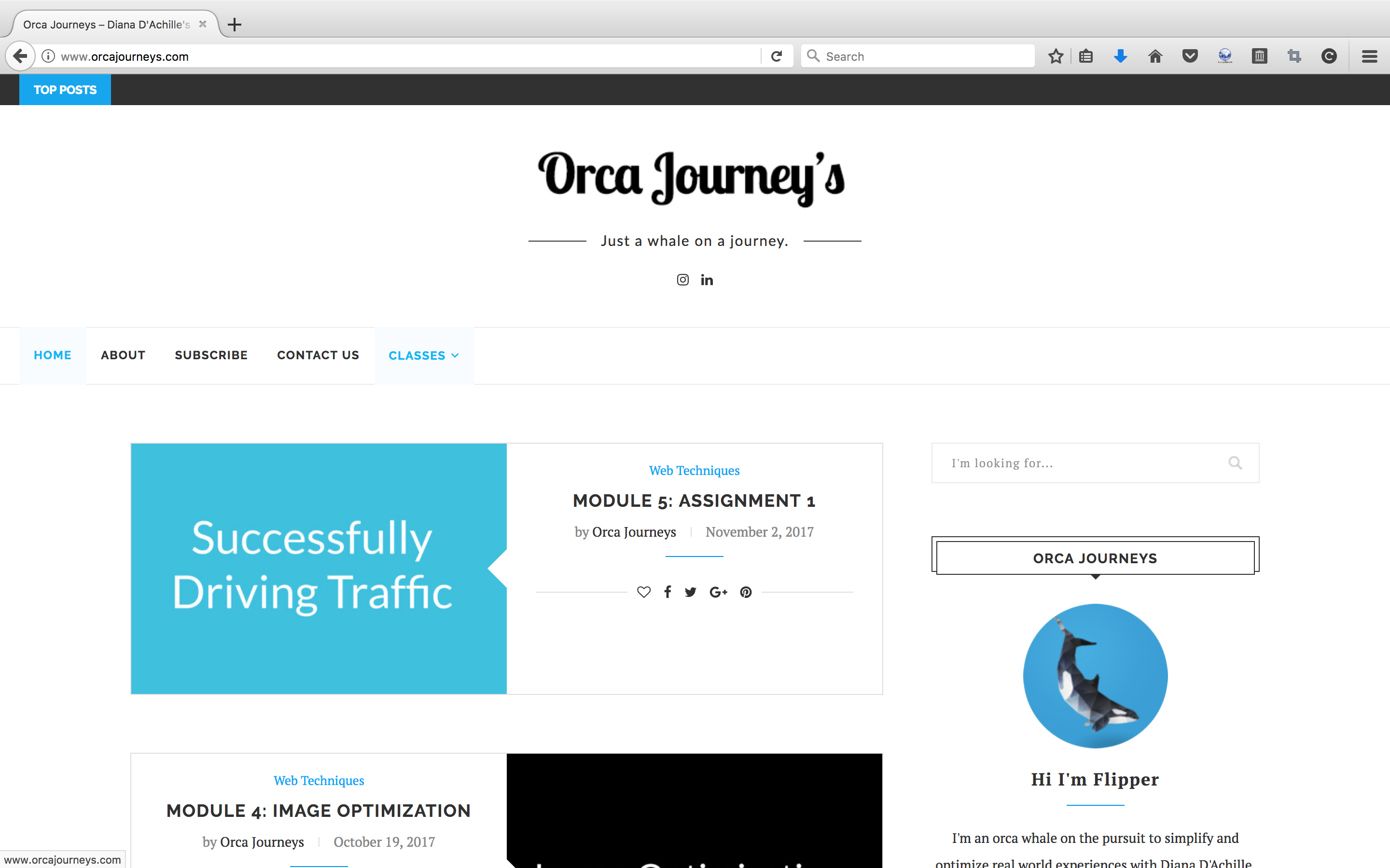
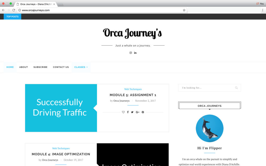
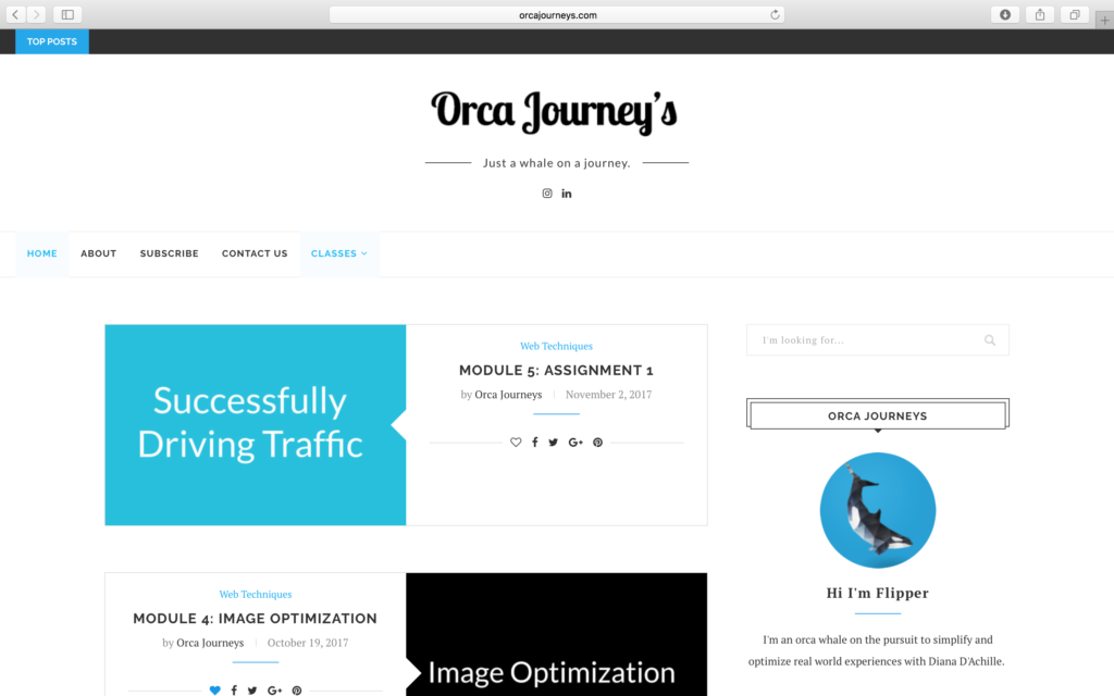
Findings:
For desktop I took my screenshots on my 15 Inch Macbook Pro at full resolution. (2880-by-1800 native resolution). It is apparent that desktop exposes more pixel density than mobile. This has allowed me to provide more content, navigational links and a side bar introducing the user to my user experience process blog.
Here are a few things to consider for desktop:
- Larger display than tablet and mobile
- Safari is the default browser for Mac
- Interactions differentiate across desktop browsers. (Pan, Zoom, Double Click Etc.)
- Long-term use
- Used traveling, on the go or workstation
- Push notifications
15″ Macbook Display Specs
- Retina display
- 15.4-inch (diagonal) LED-backlit display with IPS technology; 2880-by-1800 native resolution at 220 pixels per inch with support for millions of colors
- Supported scaled resolutions:
- 1920 by 1200
- 1680 by 1050
- 1280 by 800
- 1024 by 640
- 500 nits brightness
- Wide color gamut (P3)
Observations:
- (1.2 – 1.6) tiles above the fold.
- Side bar visible
- Navigation bar visible
Tablet
Google Chrome, Safari, Firefox
Below you will see the side by side comparison of Google Chrome, Safari and Firefox on my iPad:
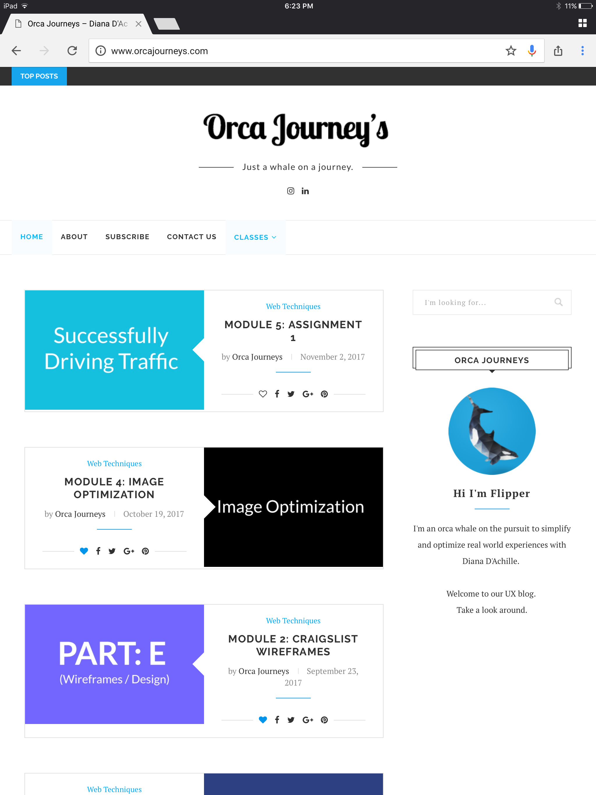

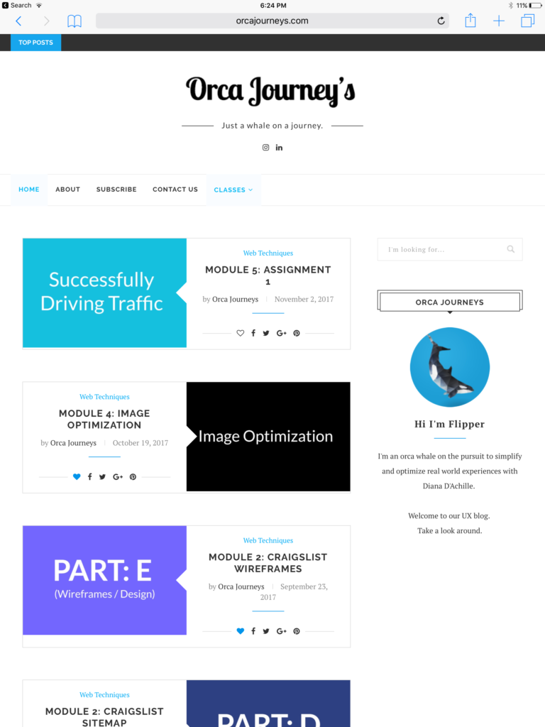
Findings:
I took screenshots on my tablet in portrait mode by holding the home button and power button simultaneously. I was surprised to find that tablet in portrait mode revealed the most number of blog tiles above the fold than desktop and mobile did. It seems like digesting content of my process blog might be most enjoyable on tablet, due to it’s exposed number of blog posts.
Here are a few things to consider for tablet:
- Larger display than mobile.
- Smaller display than desktop.
- Safari is the default browser
- Gesters differentiate across tablet browsers. (Pan, Zoom, Double Tap Etc.)
- Portable (Easy to pack)
- Used primarily for traveling and on the go.
- Push notifications
Observations:
- (3.2 – 3.5) Blog posts exposed.
- Navigation bar visible.
- Side bar shown.
